Shopify’s One-Page Checkout – Conversions Drop By 80%

Shopify recently unveiled a substantial overhaul of its ecommerce checkout experience, transitioning merchants from a traditional multi-page process to a new streamlined single page. In a September 2022 blog post titled “The World’s Best Checkout Just Got Better,” Shopify extolled the redesign as superior and optimized for higher conversion rates.
“Shopify’s new redesigned checkout is shorter, faster, more intuitive, and all on one-page,” the company declared. Specifically, Shopify claimed consolidating the entire checkout flow onto one page would increase speed, reduce friction, and improve the buying experience compared to a lengthy multi-page process.
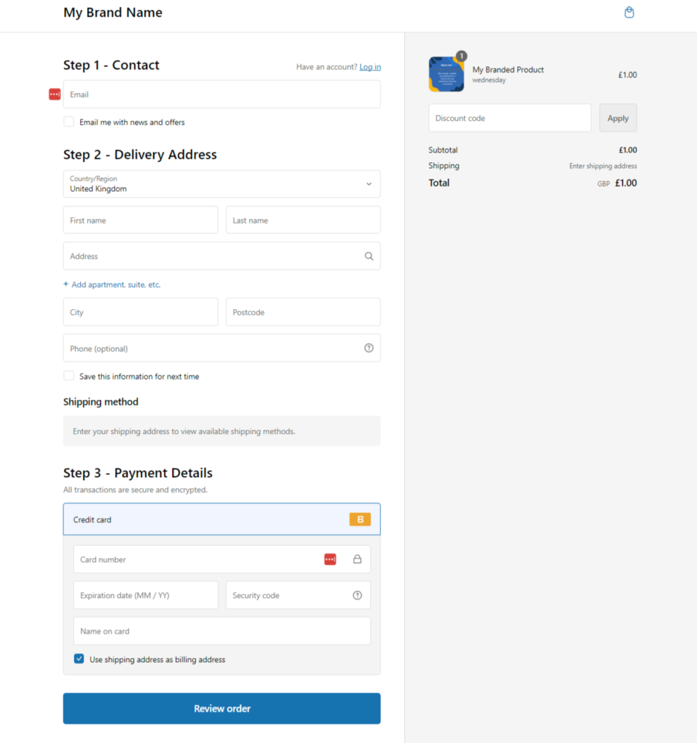
Shopify stated the unified page limits page loads, presents all information in one place, and allows pre-filled customer data to be collapsed for quicker completion by returning buyers. The company suggested the simplified mobile checkout would also boost conversions on small screens.
“With fewer page loads and a shorter shipping rate load time, buyers can complete their purchases faster,” Shopify’s announcement explained. “We’ve also automated the credit card name filling and simplified the billing address selection, further speeding up the process.”
Additionally, Shopify said the checkout update provides easier customization thanks to their new extensibility engine. The company promised the redesign is built on a high-performance technical platform designed to handle large order volumes quickly and reliably.
“Our one-page checkout is built on top of an always-improving checkout platform that’s low-latency, reliable, compliant, and can handle up to a hundred thousand checkouts per minute,” Shopify claimed.
Shopify also framed the change as bringing their checkout in line with “the future of identity-driven shopping” offered by digital wallets and automated form-filling. “Our new checkout experience will be able to recognize buyer information on pre-checkout touchpoints like storefronts or social media, and handle these partially known buyer cases by pre-filling in details, auto-collapsing and accelerating buyers wherever applicable,” the company explained.
Internally, Shopify found the one-page redesign increased average purchase completion speed by 4 seconds compared to the old multi-page flow. They positioned this update as optimizing the buyer experience by reducing steps and friction.
Merchants Voice Strong Opposition to Forced Checkout Changes
On October 2 2023 shopify officially announced on their changelog that the onepage checkout was the new default checkout for all stores. https://changelog.shopify.com/posts/one-page-checkout-is-now-the-default-shopify-checkout
But just weeks after Shopify automatically rolled out the new single-page checkout to merchant stores in early October 2022, significant backlash began brewing in the Shopify community forums.
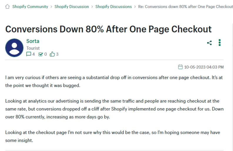
Rather than praising the “world’s best checkout,” many sellers reported abrupt plummets in conversion rates of 50-80% after the redesign went live. “I am very curious if others are seeing a substantial drop off in conversions after (updating to) one page checkout. It’s at the point we thought it was bugged,” one merchant complained.

“Shopify have forced merchants to have the one-page checkout, whether they want it or not,” another seller stated. “It seems quite a few merchants have experienced less conversions with it, so we should have a choice.”
In the forums, users share conversion rate drop tests, with some threatening to leave Shopify entirely if they can’t revert to the old multi-page checkout. Shopify has denied rollback requests from non-Plus merchants.
Sellers cite a range of factors for their checkout woes. Some say customers enter just a ZIP code to view shipping rates without providing an email address or other information. This results in less customer data being captured for future marketing like abandoned cart and discount follow-ups.
Merchants also complain of confusing shipping options, with buyers not completing purchases after seeing rates. “Yes, it’s a terrible design checkout page, causing lots of customer issues with wrong shipping methods, and addresses,” one wrote. “I can’t believe Shopify came out with such a dysfunctional update.”
Others suggest customers feel overwhelmed seeing everything crammed onto one page rather than presented in logical steps. Some posit the update actually increases friction for buyers accustomed to Shopify’s old three-page flow.
In an effort to stem the conversion bleeding, some merchants have tweaked checkout language to simplify the page and ease user fears. Numbering sections as “steps” and using plain headers like “What’s your email?” have shown positive early results.
But other sellers say only reverting to the old multi-page checkout will rescue their tanking revenue. They accuse Shopify of prioritizing design ideals over pragmatic business performance. Despite Shopify’s assurances that its new approach would optimize buying experiences, sellers see a disconnect from on-the-ground realities.
Ongoing Controversy Highlights Shopify’s Strained Relationship With Merchants
The immediate merchant hostility towards Shopify’s mandated checkout overhaul highlights ongoing tensions between the SaaS platform and its user base. Shopify faces regular accusations of undermining seller interests in favor of its own goals and visions.
While Shopify felt consolidating checkout onto one page matched emerging ecommerce trends, merchants who know their customers best pushed back forcefully. Sellers felt their feedback went ignored in favor of Shopify’s assumptions. The checkout controversy exacerbated mistrust in the partner relationship.
Shopify maintains that its redesigned one-page approach will improve conversion rates once buyers get accustomed to the updated flow. But the company’s unwillingness to give sellers choice and control over user experience changes on their own stores drew particularly intense backlash.
Unless Shopify listens to merchant concerns and feedback, offering more flexibility or reverting the rollout, the checkout debacle could further degrade the company’s standing with users. Forced changes imposed on store owners already harboring distrust may continue fueling sentiments that Shopify prioritizes its priorities over user needs.
Ongoing frustration may accelerate merchant defections to rival platforms. Some sellers speculate that Shopify aims to essentially “trap” them within its ecosystem at the expense of customization, control, and design influence over their stores. The checkout controversy seems to validate these fears for many users.
Time will tell whether Shopify modifies its approach to ease seller unrest over the checkout redesign. But the immediate explosion of complaints and demands for reversals or options highlights deep divides in the Shopify-merchant relationship. Despite promises of optimizing buying experiences, Shopify severely misjudged how core users would receive its major checkout overhaul. The rocky rollout offers lessons in understanding customer perspectives before dictating changes to their businesses.
What’s your experience of the new one page checkout we’d love to hear about it, comment below!


